Color preferences vary as much as personalities. Some people love to surround themselves with bright, bold colors, while others prefer the soft subtlety of neutrals. So is there a right and a wrong when it comes to palettes? No not really, but there are a few things you can do to make your choices flow seamlessly from one room to the next throughout your home.
Keep it consistent. Keeping the color consistent is especially important in a house with an open floor plan. Pick one main hue – whatever that may be – and use it for all the walls of connecting spaces. This creates a base for accent colors to really stand out against.
Pay attention to sight lines. When you’re standing in one room, do you see the walls of another? If you can, make sure that the colors of all those walls work together. It can get really crazy if your eyes jump from yellow to blue to green and back again.
Keep it in the family. One way to make sure your colors all coordinate is to pick different variations from the same color family. If the main color is blue, you might select a gray-blue, a pure blue and a navy paint as you move from room to room. The same concept can be used for accessories and throw pillows.
If that is too much variation for you, you can also stick to different tints of the same paint, i.e. choose from different options on the one paint card!
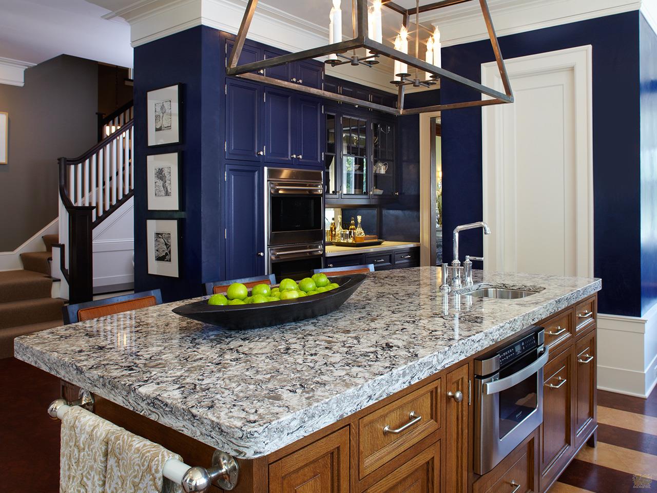
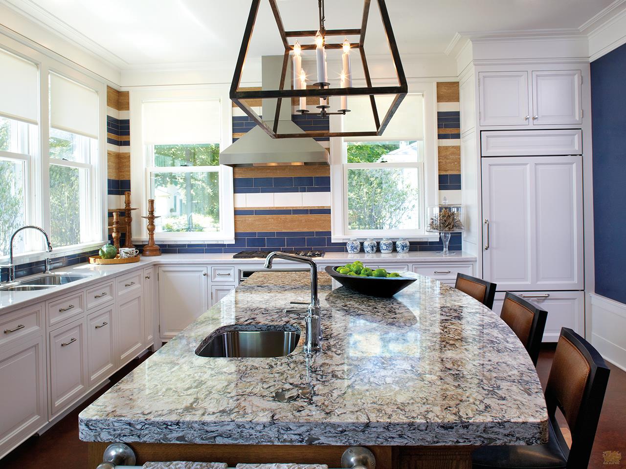
Take a look at this beautiful Cambria kitchen featuring a palette of blues, grays and whites. It’s a great example of how consistency and flow doesn’t have to mean boring!